Reteller
Staring at the blank page is probably the most intimidating part of writing. Let alone typing a large text. With Reteller, you can create entries effortlessly using just your voice. Whether you're on mobile or tablet, our AI takes your spoken words, improves the text, and structures it for you.
Project Info
Role
UX/UI Designer, Concept. Feature Lead
Tools
Figma, Adobe Illustrator, Adobe After Effects
Device
Smartphone, Tablet
#1 Overview
Problem (s)
- Users often find typing on tablets and phones intimidating when creating written content, especially at work
- No guidance on structuring notes or articles when using voice interaction makes the user more reluctant to use it
- Users often overlook the built-in dictation feature because it's hidden
- Users are afraid of making mistakes when writing
OUTCOME
- I added a voice interaction functionality to reduce reliance on typing
- I added chips that serve as hints of what the user shall talk about during the recording
- I made the voice recording functionality more expicit by adding a button
- The AI improves and structures text after transcribing it
#2 Design Process

1. Ideation
Ideated functionalities together with the Product Team Lead and gathered information on technical feasibility from DEV Team

2. User stories
Formulated user stories

3. Prototype LoFi
Created LoFi wireframes

4. Internal Feedback 1st
Conducted 3 feedback sessions with Front-End Developer, Back-End Developer, and ML Engineer
5. Prototype MidFi
Created MidFi wireframes
6. Internal Feedback 2nd
Conducted 4 feedback sessions with Front-End Developer, Back-End Developer, ML Engineer, and Business Team
7. Final Design & Documentation
Iterated on the prototype and prepared the documentation for developers
#4 Final Design
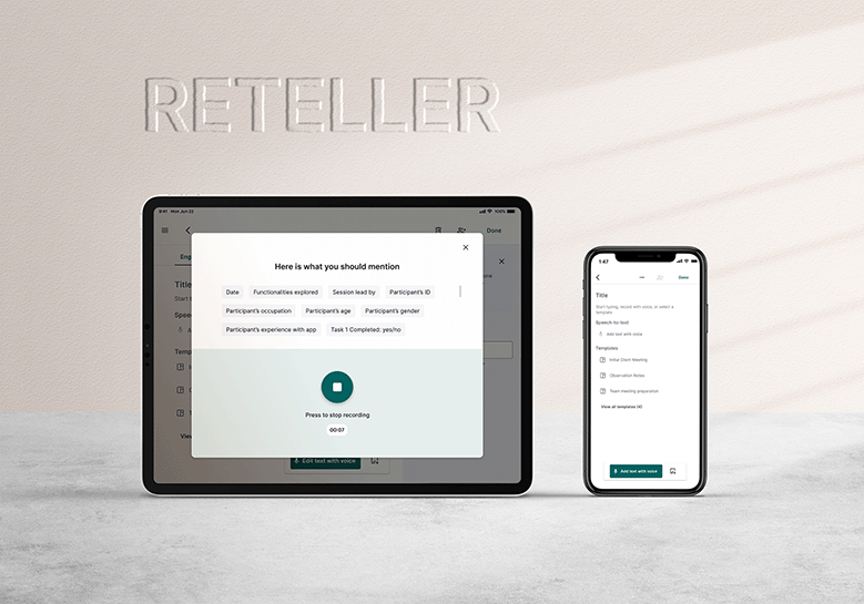
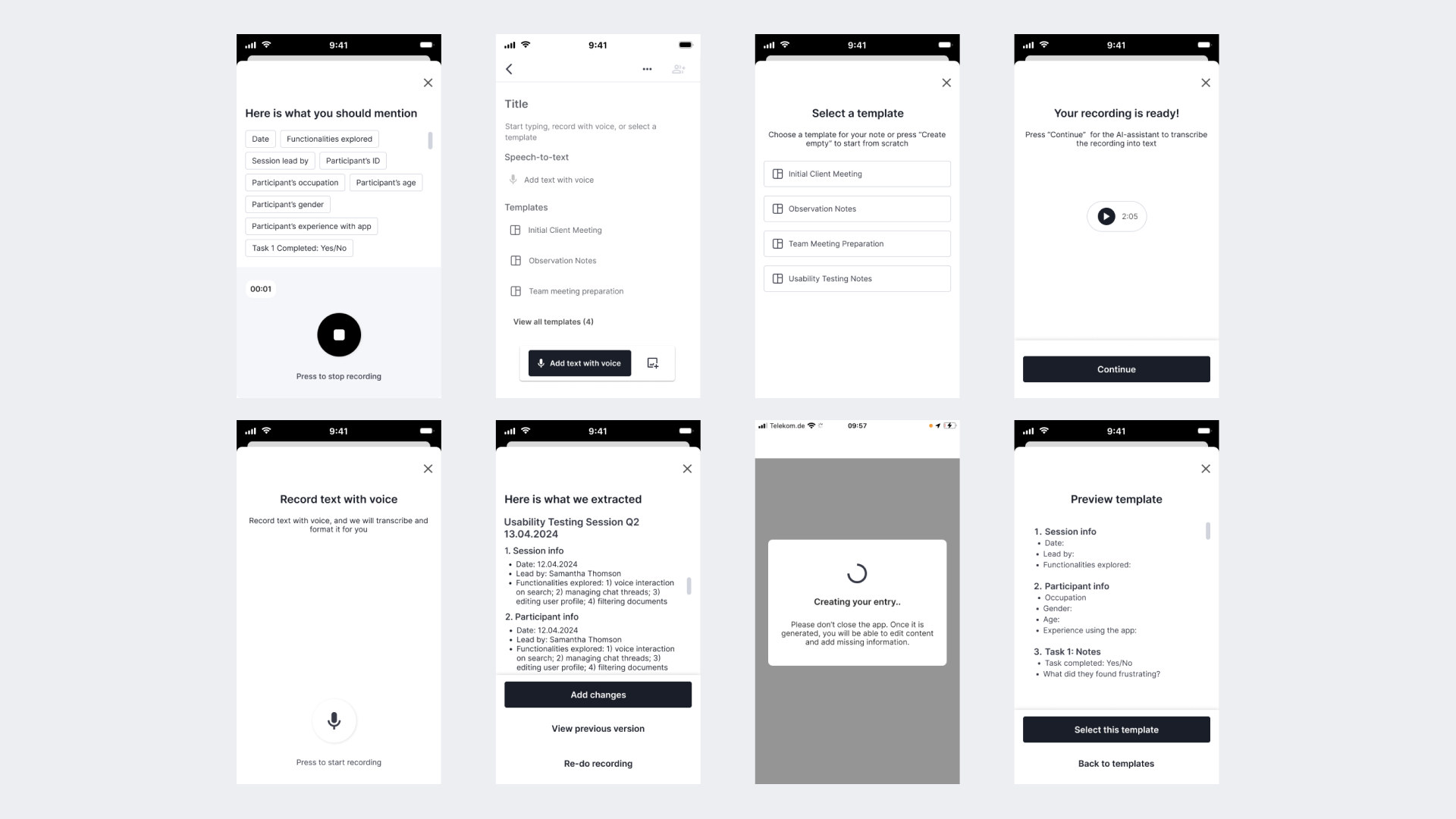
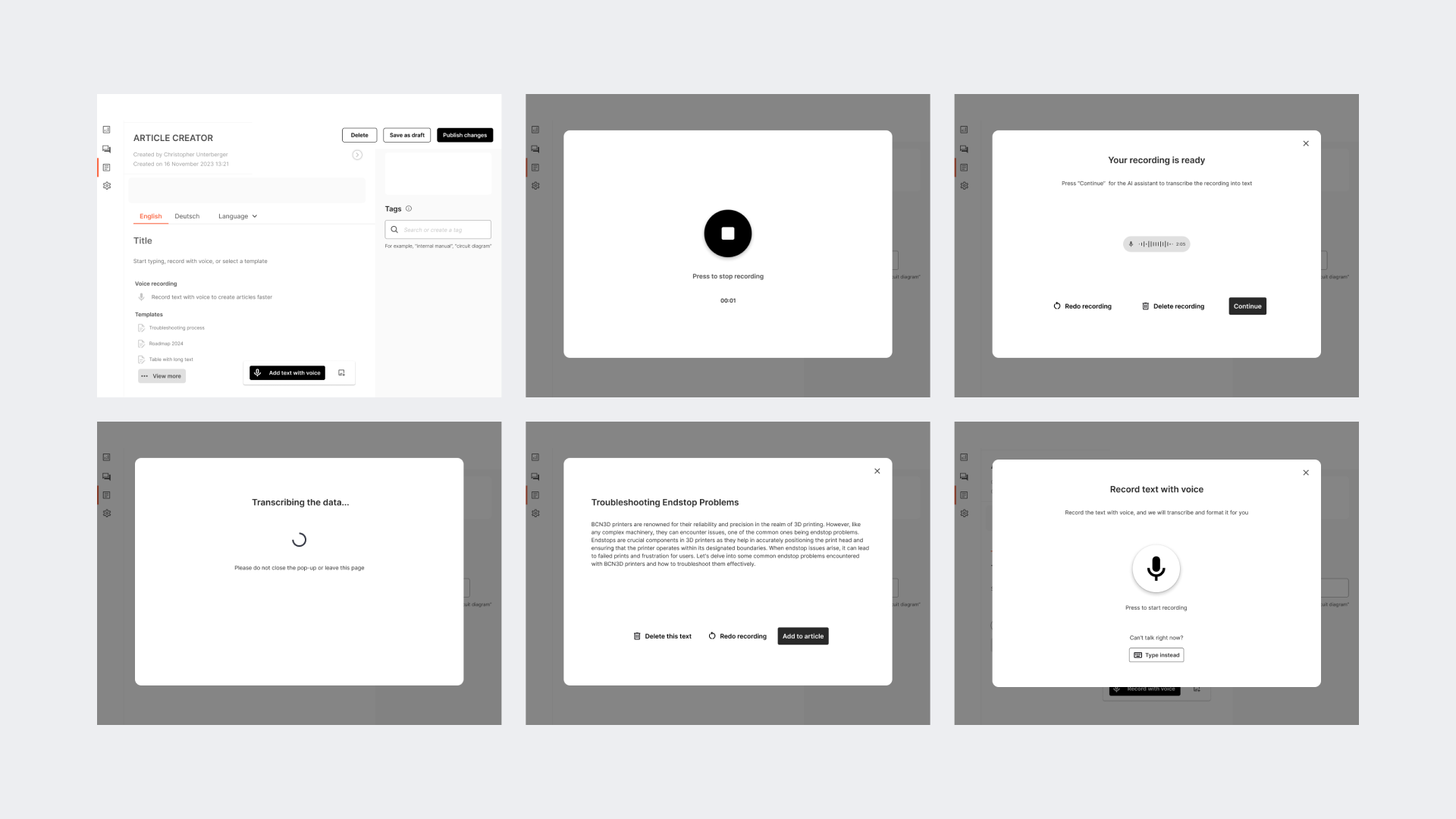
Functionality 1: CREATING NOTES WITH VOICE
As a user, I want a mobile and tablet app that enables voice recording of my thoughts, lectures, or meetings and utilises AI to analyse and structure the content for easy review and editing, so that I can save time and streamline the creation of notes and articles.
Key design decisions
- A pop-up appears when the user taps the button to create a new entry, making it easier to find on a tablet.
- On a phone, the pop-up shows up only when the user taps the button since pop-ups are more intrusive on mobiles.
- Hint chips appear based on the selected template to guide the user during recording.
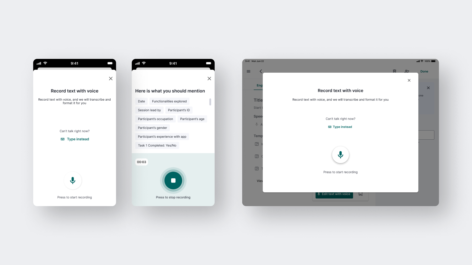
Functionality 2: TEMPLATES
As a user, I want a mobile and tablet app that allows me to choose from a variety of templates to structure my recorded thoughts, lectures, or meetings, so that I can easily organise and present my ideas in a clear and professional manner.
Key design decisions
- Users can choose a template from the pop-up or the blank page screen, making it easier to find.
- On a tablet, there's a button to preview a template before selecting it, helping users make informed decisions.
- On a mobile, tapping a template opens a preview first, saving screen space and ensuring users make informed decisions.
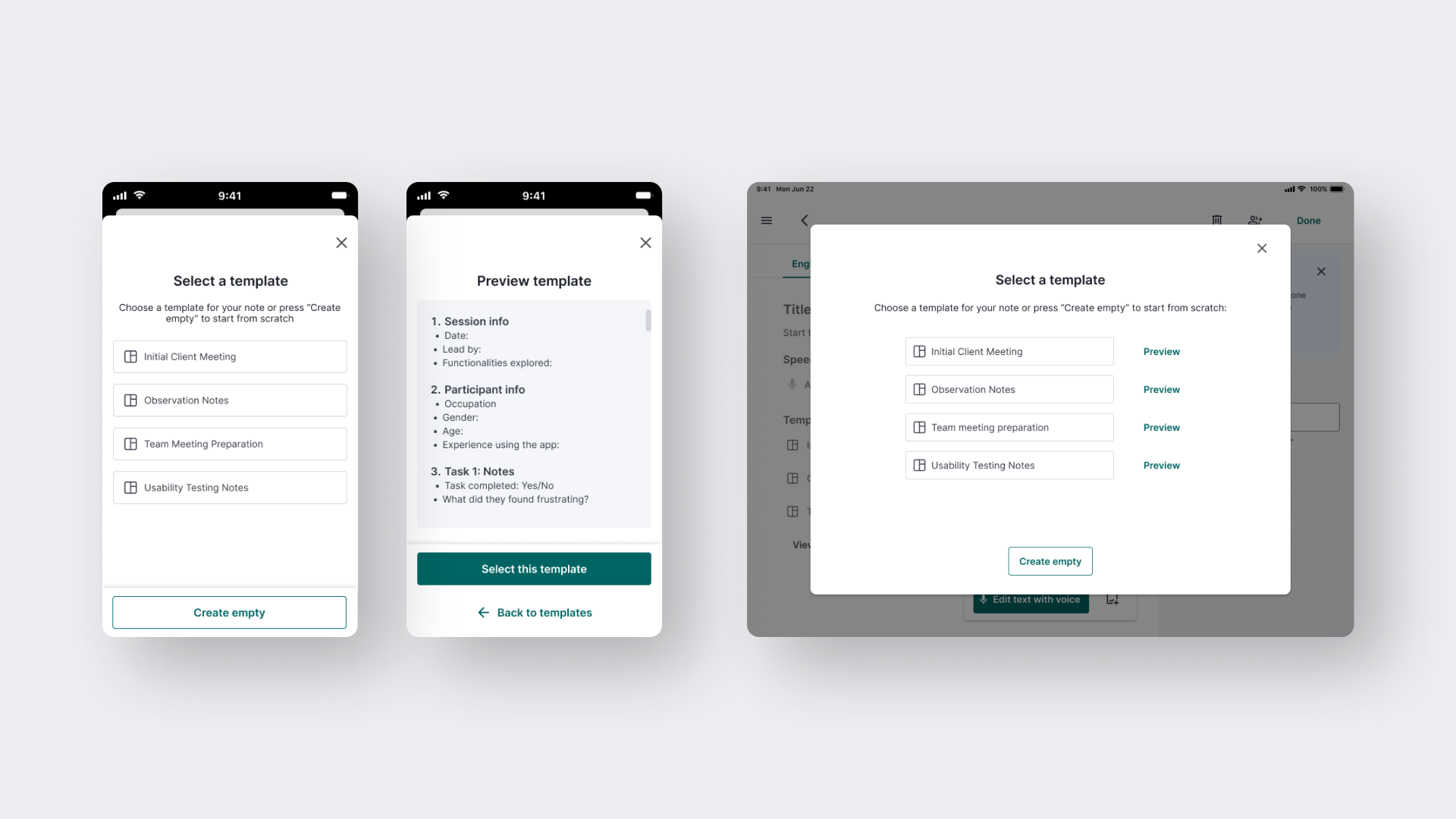
Functionality 3: EDITING TEXT WITH VOICE
As a user, I want to create and edit notes using voice recording, so that I can minimise typing and work more efficiently.
Key design decisions
- Users can preview changes before applying them to the recorded text.
- Users can load a previous version of the text if they change their mind.
- While recording changes, users can scroll through the current entry to see what's already there and what needs to be changed.
#5 Internal Feedback & Iterations
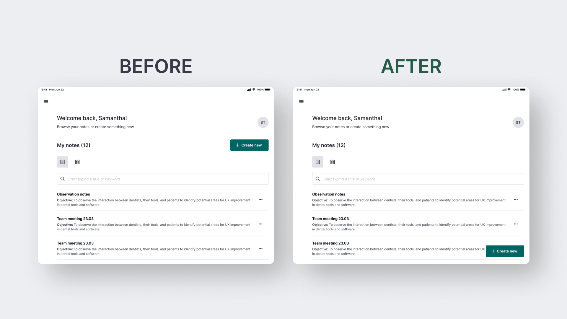
PLACEMENT OF A BUTTON ON TABLET
Initially, the "Create New" button was placed at the top next to the "My Notes" heading. After internal testing on tablets, 3 out of 5 participants said they expected it at the bottom. This is because the floating button stays accessible no matter how long the list of entries gets and the user scrolls through it. Additionally, people use tablets differently: some hold them vertically, others horizontally, and some place them on a stand at an angle. Placing the button lower accommodates these various uses.
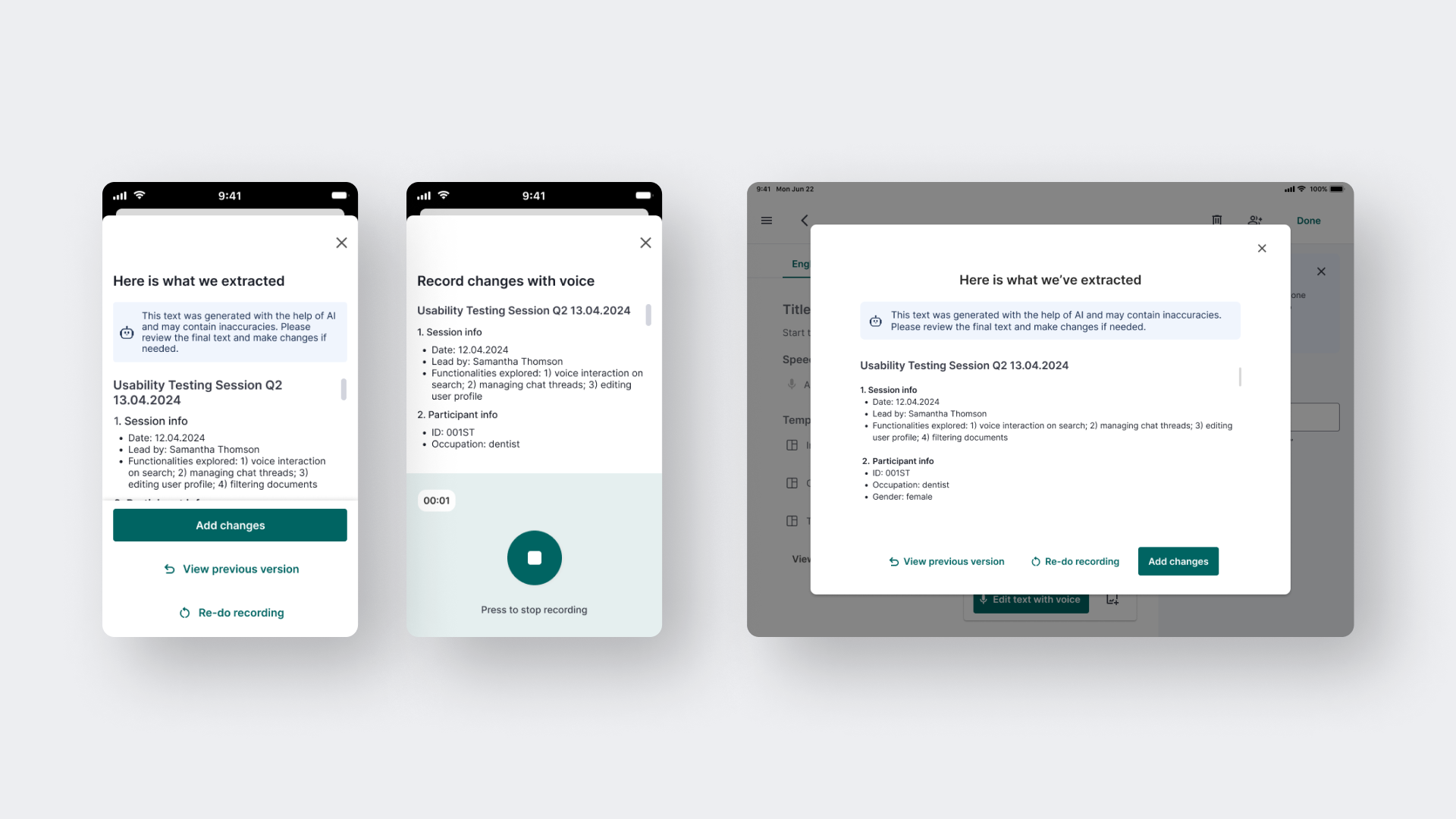
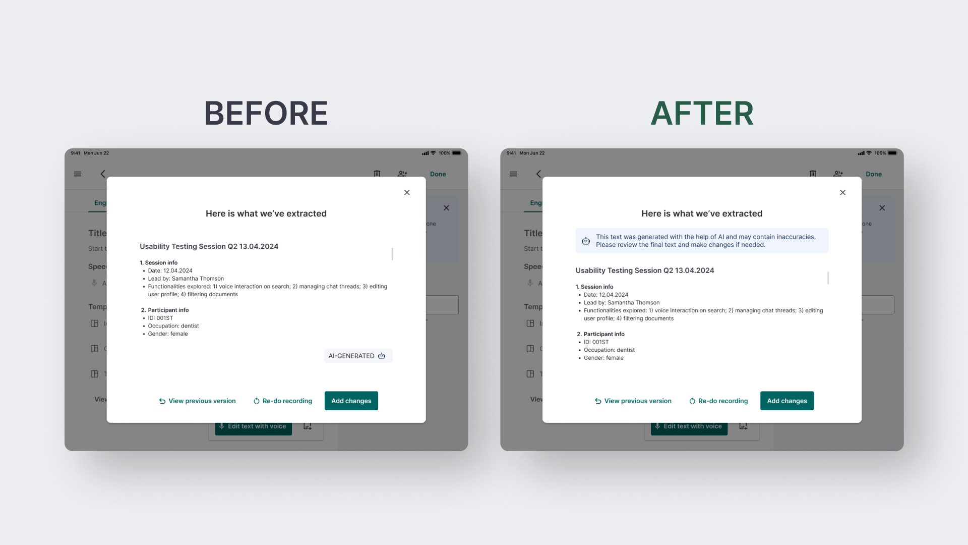
EXPLICIT AI DISCLAIMERs
Although AI indicators appear on many screens of this product, we didn't include an explicit AI disclaimer. A machine learning engineer suggested adding one to ensure users understand that AI can make mistakes or misinterpret input data. Therefore, we added an AI disclaimer message to the screen with extracted text.
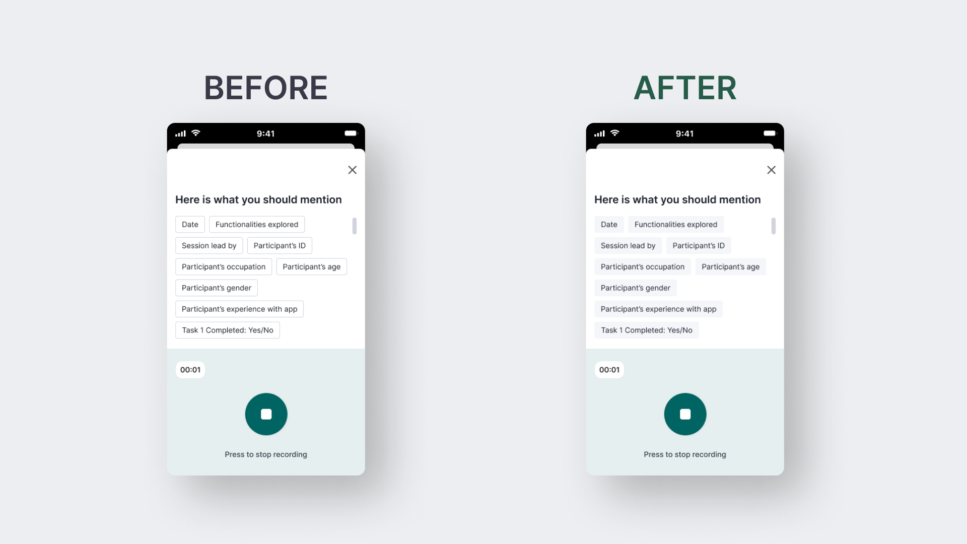
THE DESIGN OF CHIPS
Initially, we used outlined chips for hints. However, since they seemed clickable to the participants of internal testing, I changed the design to grey filled chips.
#6 LoFi Wireframes
Interested in working together?
Let’s connect!
Contact me to collaborate on a product, discuss design and research issues, or chat about great books